Any time you look at your phone, they are there. Any time you use social media, they help you. Any time you browse a website, shop online, call a friend, play a game – essentially do anything digital-focused – they are there for you. In fact, they have been for over 40,000 years. But, odds are, your brand may be overlooking them. So, what is this mysterious “they” exactly?
In this article, we’ll be diving into the what, why, and how of iconography. Icons are all around us, helping us along our journeys, and yet they often get overlooked. Let’s further break down why they are so important and dig into some things to keep in mind.
Let’s get iconic
You already know what an icon is – you may even have advised on them a few times when working with a creative team to develop on-brand collateral for your campaigns. But, why are they important enough to have an entire article written about them? Because icons help your users find their way and they are crucial to your users’ journey.
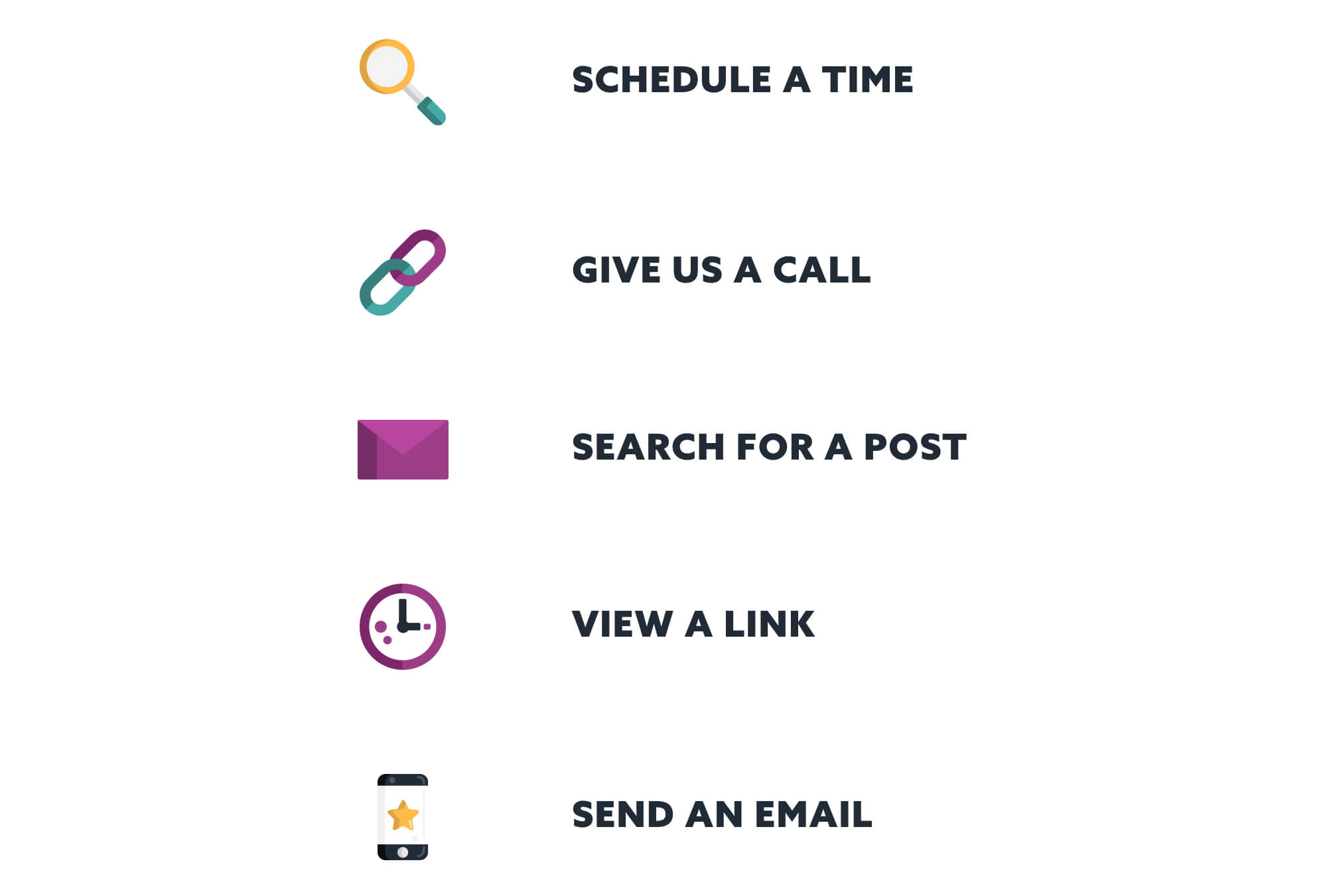
Icons are visual wayfinders used to lead a user where they need to go without relying on language. Let’s play a little game. Take a peek at the icons and actions below and match the icon to the desired action:

Yeah, that was incredibly easy! We humans are visual beings who rely on sensory cues to process what action is required of us. It’s universal to know that an envelope icon communicates “send an email” or that a phone icon communicates “give us a call.”
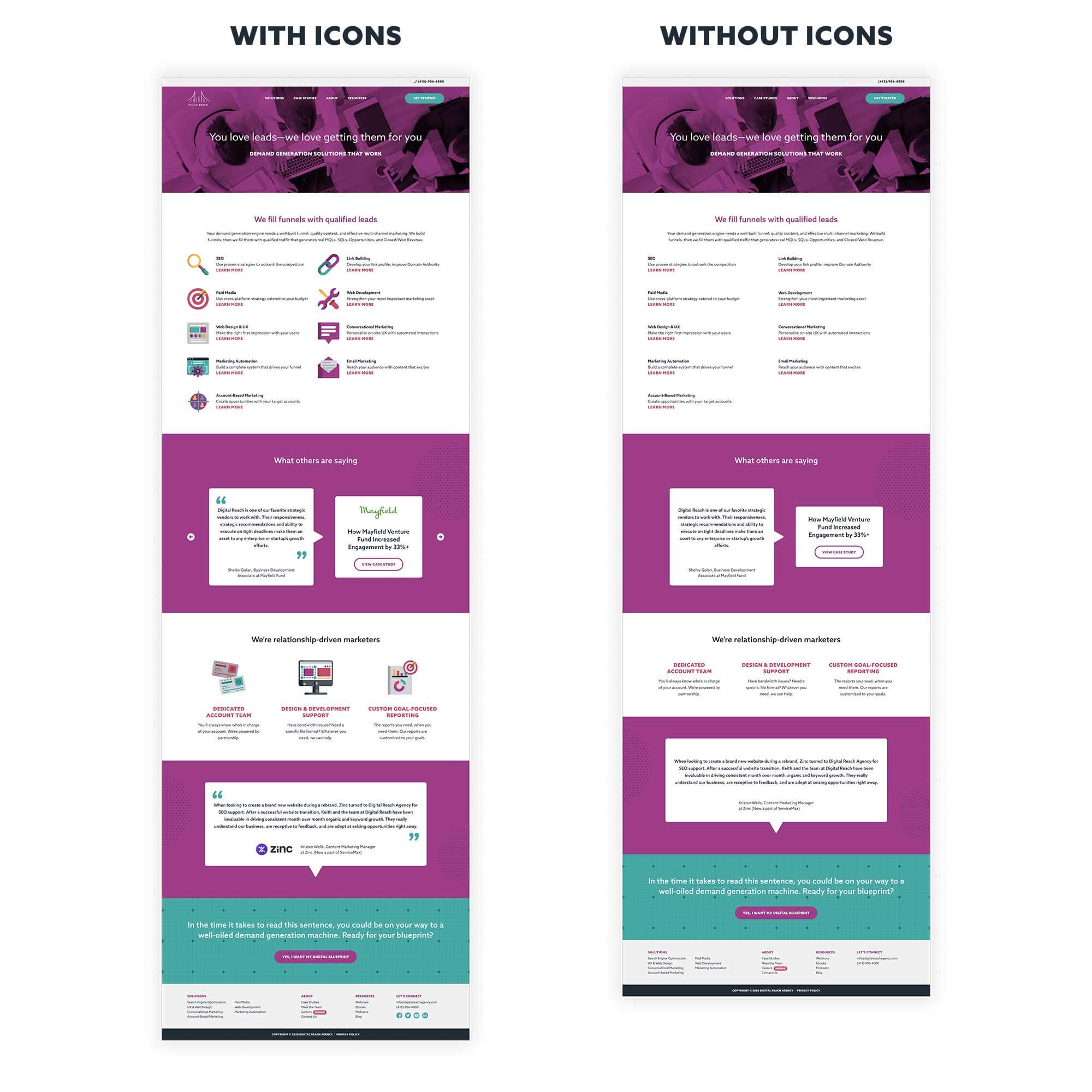
An added benefit of using icons is the delight and organization they contribute to the user experience. Take a peek at the two images below:
This image above is actually our Solutions page. On the left, we see it as usual, in all its beautiful glory. On the right, we see it without iconography. Pretty boring, right? It lacks personality and purpose. More importantly, it feels confusing and information-heavy. Next time you’re browsing the web or posting on your favorite social media platform, imagine the experience you would have if there were no icons. Yikes.
All too often, we see brands using confusing, outdated, and even stock icons that lack personality or meaning. Using custom icons can elevate any touchpoint in your brand experience. Ensuring your icons are on-brand and that they remain a priority allows you to differentiate yourself. But, before you have your creative team dive in, let’s review a few rules that need to be followed.
3 golden rules of iconography
Now that we know what icons are, why they are important, and that you need to keep them on your radar, let’s go over the 3 golden rules of iconography.
1. They must enhance functionality
The purpose of an icon is to represent an action or idea. They guide the eye where it needs to go and, in doing so, must remain functional. When searching for something, you expect a magnifying glass icon. When watching a video, you expect the play icon. Icons should always be intentional.
2. They must be recognizable
Icons need to be easy to understand and recognizable. As mentioned above, users often expect certain types of icons. When your team is creating icons for your brand, remember to keep them simple. Don’t overcomplicate it, otherwise, your users may not know what it represents. It might look cool, but it needs to lead to an action or convey information clearly.
3. They should be tested
Just like any visual element of your brand, icons should be tested. Whether trying out a different style or switching out different types, always test your icons.
If you and your team keep these three rules in mind when creating your new on-brand iconography, you’ll be golden.
Finding your way
Anytime the creative team here at Digital Reach digs into a website or brand design project, we always include custom iconography. It is such an integral part of the overall brand experience you provide your users and should always be considered.
In need of custom brand collateral that differentiates you from the rest? Reach out and let’s chat!


