What is a CTA exactly?
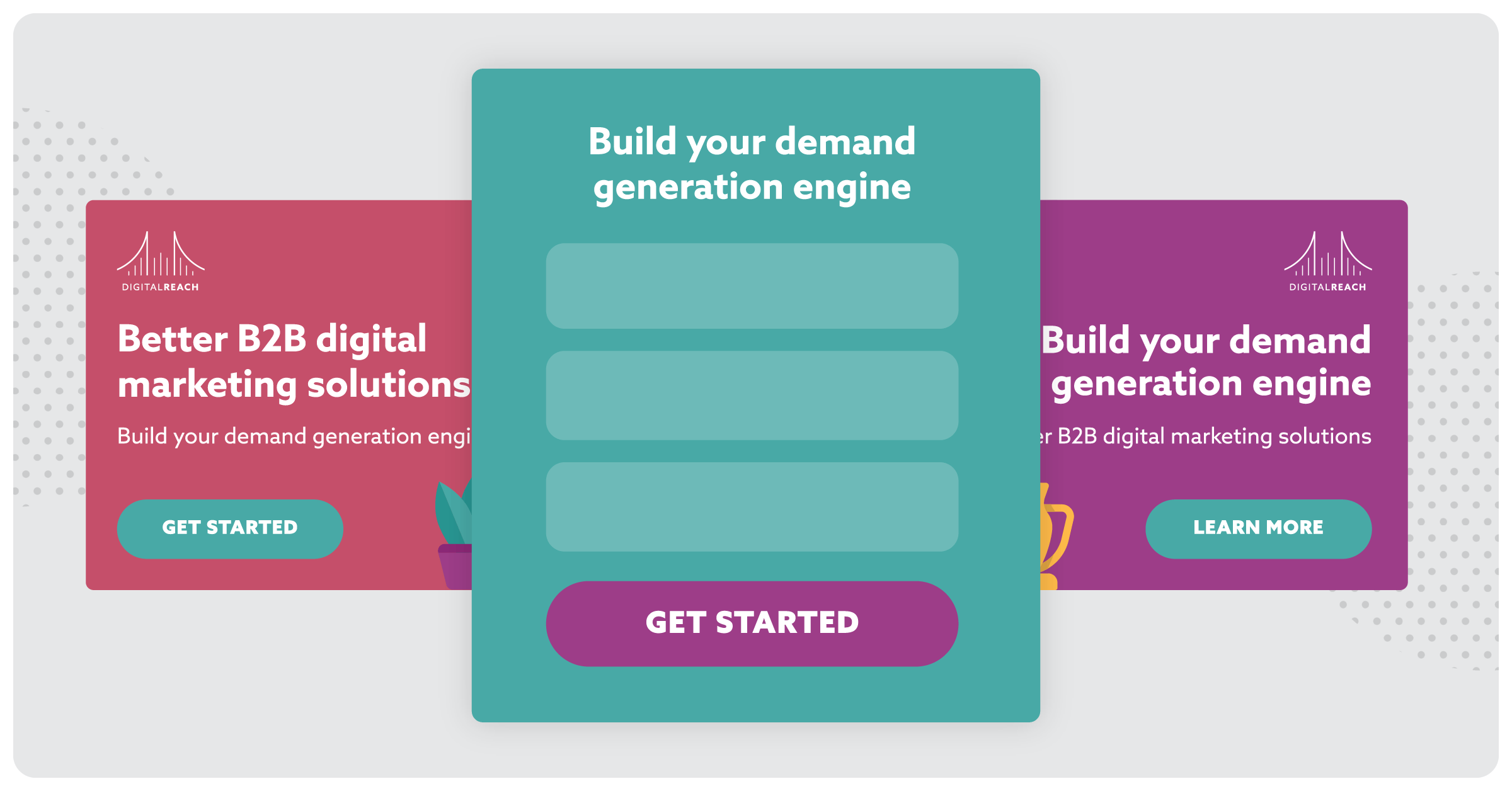
A CTA, or call to action, is the call to your audience to complete a step you want them to. Something as simple as “Learn More” or “Download Now” are common CTAs you’ve probably seen in your inbox, on a landing page, or in an ad.
While CTAs are often an afterthought on the pathway to campaign success, they’re a critical part of the conversion process that can affect the number of conversions your campaign ultimately gets.
All of this for a little button? Yes! But a CTA is more than just a button. Let’s look at where CTAs live and how you can make them more engaging for your prospects.
For PPC, or pay per click ads, there are a few different places a CTA can live.
- Ad CTAs
- Landing Page CTAs
- Form CTAs
Ad CTAs
An ad CTA is what you want your prospect to do with the ad. Do you want them to learn more about your new services? Do you want them to download an eBook?
All of those are examples of calls to action in an ad. Note that this can also include button content like Click Here Or Learn More. These button CTAs can be just as important as the CTA in your ad copy or imagery.
Landing Page CTAs
Landing page CTAs, like ad CTAs can be found in a couple of different places. Often, a call to action is added in the header image or at the top of the landing page. It’s important because it tells your prospect what to do.
Landing page CTAs can also be found on the top and bottom of a form on the page.
Form CTAs
Form CTAs are often overlooked but can be just as critical to get conversions as headlines on the landing page. But before you cross the finish line with a record breaking number of conversions, it’s important to understand why form CTAs are important.
First of all, there are a few things working against you when it comes to getting conversions in general:
- Time
Most of your prospects are low on time and even if they aren’t, they don’t have a long, arduous process to get what they want. - Commitment
Make your CTA too aggressive and you’ll miss clicks. Users want something more neutral, especially if they’re first-time engagers. Keep it simple and non-committal so your users don’t feel like they’re being sold to. - Competition
Not just your actual competitors but competitors for your attention.
Think about the form CTA as the last CTA between you and your conversion. With this in mind, it’s important to make sure your form CTA saves time, requires a low-commitment action, and stands out on your form/landing page.
Engaging Customers Before the CTA
Just like the sales funnel, there’s been a decision process associated with the CTA click. While we all want it to be about the overwhelming desire to learn more or get started, it’s important to note that there are several things a prospect thinks about but they click that CTA button.
Because are minds are always ready to jump to the next thing, here are six things you should include in your strategy to help your CTA make the grade:
- Arrest Attention
Get your prospect to stop what they’re doing and pay attention to what you’re trying to convey. - Build Connection
Let your audience know you understand their business by listing pain points that are specific to them, instead of creating generic copy in hopes of catching as many people as possible. - Build Problem
Use those pain points to lay out a common problem you know they have. - Build Interest
Prove that you not only understand the problem, but you’ve worked with people in their position or situation to solve that problem. - Build Suspense
Give them some interest-piquing details, but don’t outline an entire case study. Provide statistics or details that don’t tell the entire story and will make them want to learn more. - Transform Momentum
Capture interest by giving them something they want or need. Provide a solution first before asking for something in return. (Psst: this is where the CTA comes in!)
It’s important to think of your conversion tactics as a whole strategy. You want to have everything working together to create stronger results rather than relying on one or two elements to carry the weight of the campaign.

Engaging Customers with CTAs
Making an engaging CTA doesn’t have to mean creating clever copy. In fact, keeping your CTAs short and simple is the best way to get clicks. With this in mind, there’s a small list of commandments we want to share on what not to do with your CTA:
- Don’t make your CTAs overly clever to the point of confusion. Make sure your prospect knows what they’re supposed to do.
- CTAs aren’t just text. They can also be buttons, and they need to stand out.
- CTAs aren’t just hyperlinks. Writing “Learn More” and hyperlinking your landing page may get some clicks but it won’t perform as well.
- CTAs aren’t memes, gifs, or videos. Don’t make your customer burn their calories trying to figure out what they’re supposed to do.
- Make sure they go somewhere. And by somewhere, we mean a landing page. Sending your prospects to a generic page without a clear call to action will hurt your campaign, not help it.
Now that we know what not to do, here’s are a few things you need to do to make your CTA engaging for your customers:
- Make it a button.
Yes, it seems obvious but the list of what NOT to do was not created in a vacuum. As tempting as it might be to do something cute or clever with your CTA…don’t. Make it a button. - Be sure the design stands out.
Be sure to make the button design stand out. Typically in a brighter color or with an outline so it draws the eye of the user and encourages them to click.Creating a button in a contrasting color in your color palette can help increase clicks by 21%! If you’re not sure you want to go that route, why not test it out?Also, don’t bury your CTA button. Above the fold is always a good place to put it so your customers don’t have to scroll down to take an action.
- Stick to low-friction words on the button copy.
High-friction words are things that make the customer feel like they have to give something before they can get it. Buttons with words like “Buy,” “Sign-up”, “Give,” and “Sponsor” are low performers unless you’re on an eCommerce or non-profit site.There are exceptions to every rule, of course, but sticking with medium to low-friction keywords in your CTAs will help improve your click-throughs and engagement by keeping a calm, neutral tone.Here are some medium to low-friction words to help you get started:
Medium: Learn, Visit, Share, Start
Low: Discover, Get, Receive
- Pick just one.
Decision fatigue is real. In his book, Building a Storybrand, author Donald Miller asks the reader to think about their customers as people on a treadmill. The more you ask them to do, the more calories they have to burn. The more calories they have to burn, the more exhausted they’ll feel.With that treadmill example in mind, save your customers some time and just give them one thing to do. You’re more likely to get engagement on one solid CTA than create a series of CTAs that force your customers to make a choice.
At the end of the day, a CTA is only as good as the clicks it gets. Be sure to test different CTA copy, button design, and above the fold placement. Take the actionable data you find and create your own best practices.


