The History of Our Logo
When referencing our humble beginnings, we often use the term “ragtag.” Digital Reach came to life when our founder plugged in a MagicJack, turned his dresser into a stand-up desk, and recruited two friends from high school.
They started gaining clients, even without a logo or website. They knew a logo was needed, so they did want many startups do—used a free online logo maker. That obviously didn’t work out, so they worked with a firm to come up with a new logo. Thus, our bridge logo was born.
This logo and color palette worked fine over the years. But, when 2019 rolled around, we realized how outdated and hollow it felt. Our reconsideration led to a logo design refresh, which is what you see today. We kept the bare bones of our original logo, shifted our color palette, and began updating collateral. But something was still lacking. We couldn’t seem to nail down our unique style.
After struggling to make it work, the creative team slowed down and looked at the bigger picture. What we were missing was a true brand identity. The logo and color palette wasn’t enough. It left everything feeling disconnected and didn’t communicate all that Digital Reach is. So, we decided to dig deeper.

Developing Our New Look and Feel
In late 2019, we began our brand identity process. The creative team asked our founders some of the tough questions, like:
- What is our “why?”
- What do we stand for?
- What are our core values?
Our founders answered these questions, shared styles they loved and hated, and let the creative team work their magic.
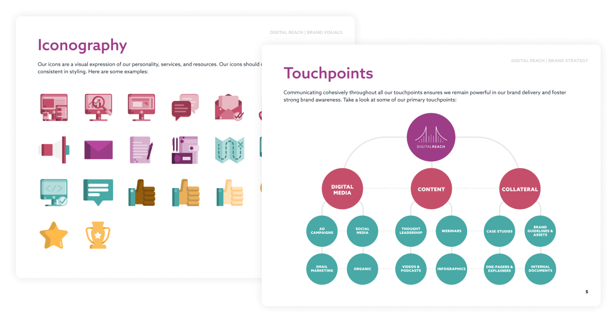
Several weeks (and hundreds of cups of coffee later), we had the beginnings of brand guidelines, illustration styles, and a brighter color palette. The illustration styles were unique and completely our own. They led the way for other assets to be created. The brand guidelines touched on every important aspect of our brand and how to use it. Things were finally coming together.

Connecting the (Brand) Dots
Once we had the brand guidelines in the works, we began determining how our brand assets would work. We dug deep into things like proper icon use, illustration style, and type of photography to use.
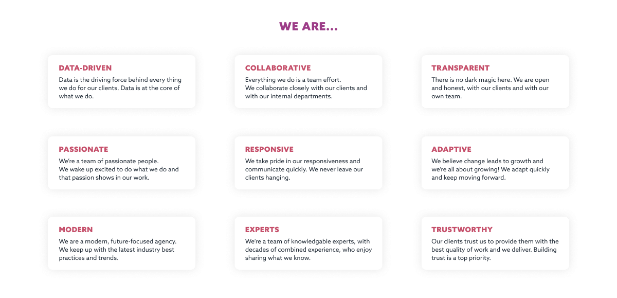
In order to fully connect the dots, we knew it was crucial for our team to be involved. After all, they are the ones representing our brand every day. So, we sent out a company-wide poll to determine our brand’s attributes. Finally, it started to feel like a true representation of Digital Reach.
We then began the process of updating and refreshing every piece of collateral—internal and external. We built up libraries for our amazing team to access, finalized our brand guidelines, and shared them across the company. But, there was still something missing… our website.

Creating Our New Website
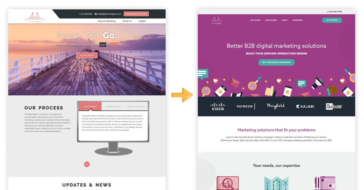
One of the most important things to consider when looking at your brand is cohesiveness and we were sorely lacking. Our refreshed look/feel was applied to all our touchpoints aside from our website and it was time. We analyzed our old website and identified pain points. We sifted through pages to determine what was and was not working. We knew the design was outdated, but as we analyzed further we realized we needed to update everything—content and all.
Once we identified what needed to be done, we got to work. The web development team whipped up information architecture, the creative team dug into building out wireframes, and content was being rewritten. Once the wireframes were complete, we moved on to designing content-filled mockups and then development. After development came the design QA and tying up loose ends. Each team worked together strategically and poured thought and intention into every decision.
After months of crucial brand self-care, we finally arrived at the long-awaited launch. And, here we are now!

Looking Forward
It’s difficult to sum up months upon months of strategy, energy, and hard work into just a few sentences. If it were up to the creative team, this would have been much more long-winded. It’s been a wild ride from where we started to where we are now, but we’re confident in the direction we took. Every brand’s journey is different and we took the scenic route. As our wonderful team continues to grow, our brand also continues to grow stronger. We’re looking forward to what the future holds for Digital Reach, to actualizing our brand vision, and are excited to show you who we truly are. Now, go explore our new website and see what we’re all about!
Ready to get started on your brand’s journey?
See what our creative team can do for you today.


