If you are marketing in the digital realm, you’ve likely heard the phrase “content is king”. While this still holds true, if content is king then user experience is queen.
Understanding how users interact with your website can make a huge impact on your conversion rates.
So how do you gain insight into potential ways to improve your users’ experience on your website? Enter Heatmaps.
What is a Heatmap?
User experience (referred to as “UX”) is a broad term used to describe how users interact with your company. For the purposes of this article, we’re focusing specifically on the UX of your website.
A heatmap is a tool that can provide a great deal of information about how users behave while on your website. Heatmaps are colorful representations of the actions visitors take while browsing. There are three primary types of heatmaps: click, move/hover, and scroll. Each type provides different information and opportunities for improving your UX. Heatmap analysis is the process of looking at these charts to gain valuable information about user behavior.
How do I get Heatmaps?
There are many tools in the marketplace to provide you with heatmap data. One of the most well-known (and what we’ll be using for illustrative purposes) is Hotjar. Some other tools you might have heard of are Crazy Egg, Heatmap.com, Lucky Orange, or MouseFlow. All these sites provide heatmap data in a similar manner. Heatmap tools vary in cost but range from free to upward of $250 per month, with a variety of features.
How do Heatmaps Help?
You’ve selected a heatmap tool, and everything is set up… now what? What does heatmap analysis tell you about user behavior? Quite a bit, actually. Remember the three main types of heatmaps (click, move/hover, and scroll? Each type of heatmap displays site usage from a different perspective:
- Scroll heatmaps illustrate how far visitors scroll down a page before losing interest
- Click heatmaps show you where users are clicking the most (or the least) when on your site
- Move/hover heatmaps show where users are moving the mouse and where they tend to hover for longer periods
Once you have data on the different types of user behavior on your website, patterns will begin to emerge. We can use these patterns to make improvements to our users’ experience. Let’s take a closer look at the different types and what this tells you about UX.
Above-the-Fold Analysis
What is this?
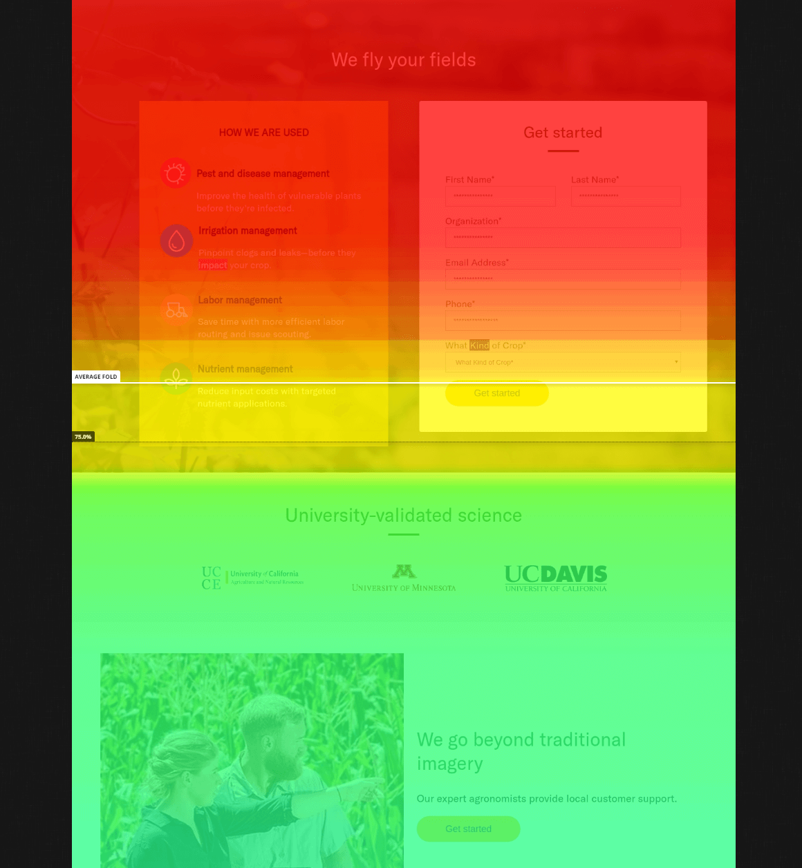
Let’s look at a scroll heatmap for a landing page. You’ll see the colors on this heatmap move from warm (red) to cool (green and blue). The “hottest” areas show what the most users see; as visitors stop scrolling, the colors get cooler.
How does this help me?
Knowing how far down people scroll on the page gives you an idea of what content they’re seeing. You can quickly tell if visitors are seeing the most important information on the page. If your key action call exists in a cooler area on the map, you can improve the page by moving it up into a warmer section.
Click Action
What is this?
Ever wonder what elements get clicked on the most on your website? A click heatmap shows you that exact information. With this heatmap, you can view where visitors are clicking and see which links and CTAs are the most used. Similar to the scroll heatmap, cool colors indicate areas users clicked. Warmer colors (yellow, orange, red) show a higher concentration of clicks in that location.
How does this help me?
Studying this heatmap, we can see that the call to action button is not performing well. We could improve conversion rates on this page by ensuring the text in the banner is also linked. We could also run an A/B split test on the button to see what text might prove more effective.
Confused Clickers
What is this?
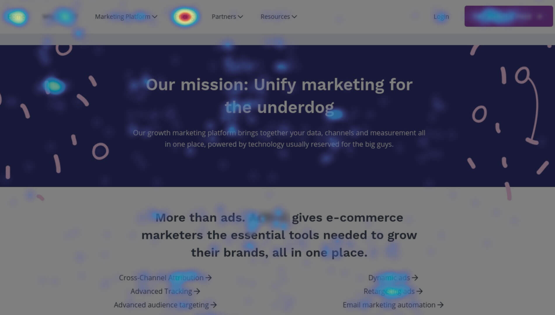
We expect to see higher click-rates on items like buttons, links, and navigation menus. But what about other areas? On this click heatmap, we see a concentrated set of clicks on non-clickable elements (the icons and text in the second section).
How does this help me?
Identifying areas that confuse users is a great way to improve your UX. In this example, we can use this information to better leverage user behavior. By simply linking those elements, we can direct users to information faster. We could also consider a redesign of that section to better show what is a clickable item.
Navigation Behavior
What is this?
Numerical data on which menu items get clicked most often can be confusing and hard to decipher. But looking at the navigation bar in this click heatmap, it’s easy to see where most users click.
How does this help me?
We can improve UX by reviewing which navigation elements are being used and which aren’t. In this click heatmap example, we see one or two of the options on the primary menu are almost never clicked. By restructuring the main menu, we can get users to the information they’re seeking faster.
Dead Spots
What is this?
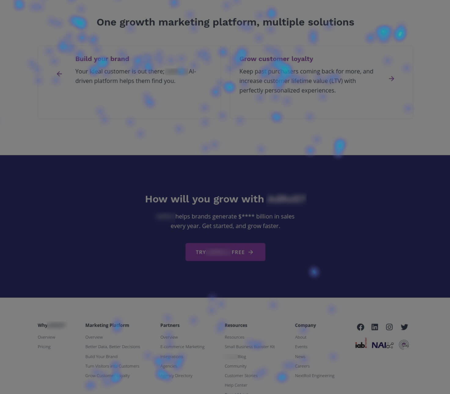
Move/hover heatmaps can provide useful information, too. Look at this example. We can see areas of movement indicated by the blue marks. The brighter blue areas show where users hovered longer.
How does this help me?
We can see on this chart that users seem to be scrolling right past the call out banner. Knowing this area is a “dead zone” and not seeing much interaction gives us an opportunity to improve our UX. Portions of a page that are not active can be redesigned for better use or eliminated.
Device Differences
What is this?
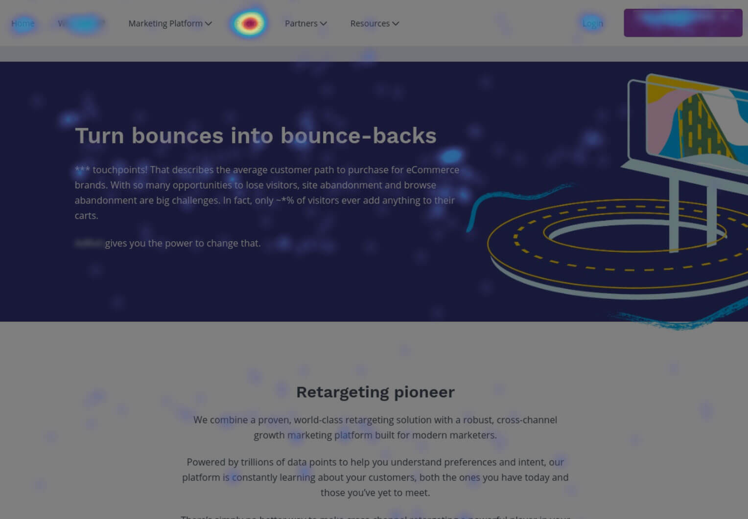
Heatmaps can also provide insight into user behavior for the same page across different devices. Look at these click heatmaps of the same page on both desktop and mobile. You can see that, while the “pricing” link is the most clicked on desktop, mobile users primarily use the menu.
How does this help me?
This kind of analysis can show areas of opportunity for specific devices. In this example, we may want to incorporate a pricing link on the mobile page. Making the information easier to access improves the UX for our mobile customers.
Advancing the Kingdom
Whether you’re looking to boost a single page or reassess your entire brand, heatmaps can help. This data gives you valuable insight into what your users are looking for. Knowing how visitors interact with your site provides new ways to give the people what they want.
Want even more insight and recommendations to improve your UX? Consider a full site blueprint and UX audit.


