Imagine having a website with a beautifully designed interface but it just doesn’t work. What happened? Most likely, bad UX is to blame. Good UX is all about putting value above aesthetics. That value is most often determined through widely accepted principles of human behavior. Luckily, most of those principles have already been researched and established by psychologists in well-controlled studies. Now, we simply need to understand and apply them to UX design.
1) Our brains don’t have unlimited bandwidth.
(Cognitive Load/Progressive Disclosure)
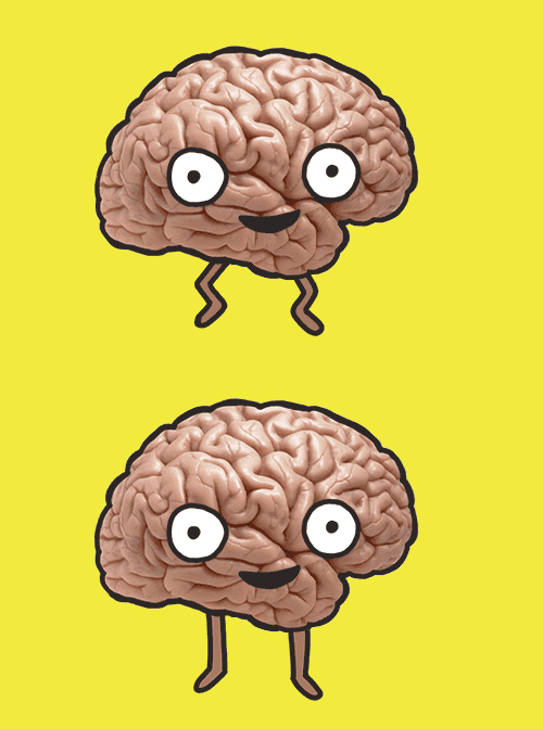
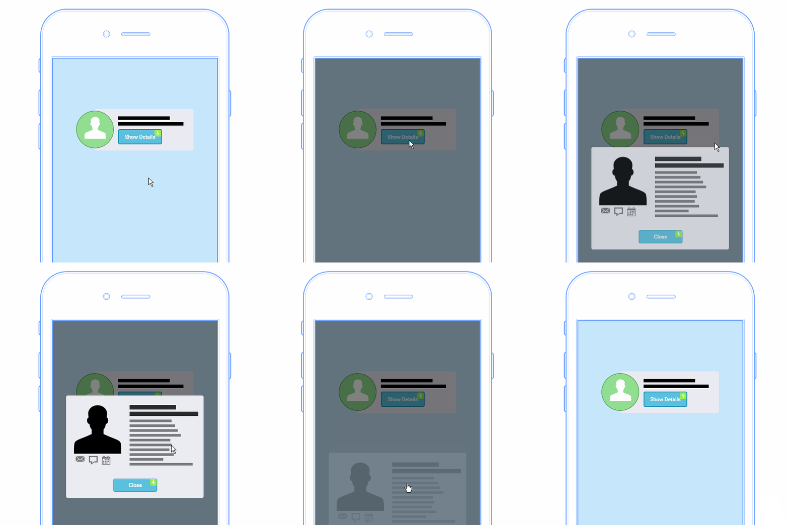
Yes, our brains are wondrous, powerful processors…but they’re not without limits. We all have a certain “bandwidth” for handling information at one time and the Cognitive Load is the total amount of bandwidth a task requires. Too high of a cognitive load will make it difficult for a user to comprehend a web page. This is where a concept called Progressive Disclosure comes in. Keeping the interface simple and gradually revealing complex features helps users get familiar without feeling overwhelmed. Here’s a fun example of how Progressive Disclosure can help a site like Hopper reduce Cognitive Load.
2) *Ding Dong* I’m really craving pizza. (Classical Conditioning)
I’m sure you’re familiar with the famous Pavlov’s Dog experiment demonstrating the ‘action-reaction’ pattern. When he rang the bell, he fed the dog a treat. He eventually conditioned the dog to anticipate a treat when it heard the bell. People are conditioned, too. As users, they receive feedback when they complete certain actions. This feedback can be subtle, like a micro-interaction. A micro-interaction is a tiny bit of motion or animation and they’re incredibly useful for providing that feedback to users. Take a button, for example. When you hover over one of the buttons on our website, it changes size.
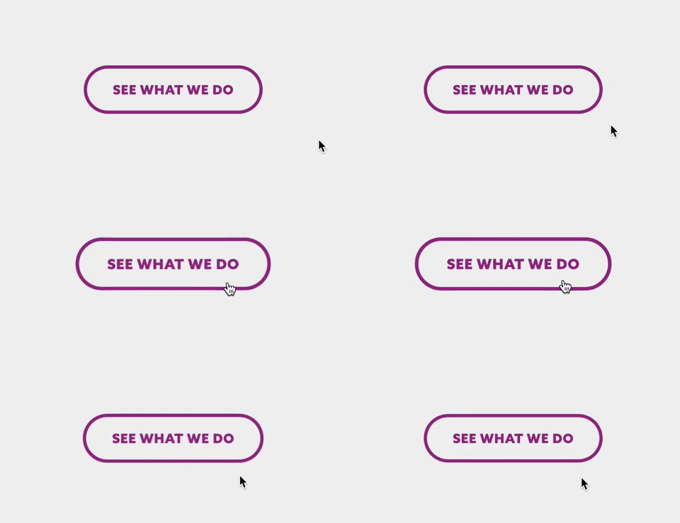
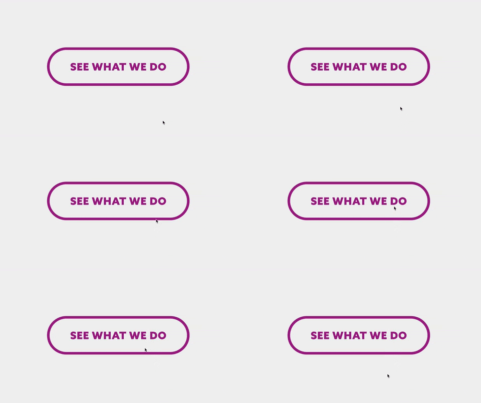
This principle of Classical Conditioning can be applied to all kinds of decisions in a website, from the brand’s visual identity to the placement of elements. Ideally, all the primary buttons should have the same vibrant color and be placed where a certain action is needed (a “call to action”) consistently. The users will eventually become familiar with the color and placement and assume similar buttons will function along the same lines.
But what if it *gasp* did the opposite of what you’d expect? That’s called a Dark Pattern. They’re these little deceptive interactions, designed to trick users into doing things, like sign up for things or purchase something you didn’t want.
3) Hey, isn’t that Keyboard Cat? (Isolation Effect or Von Restorff)

The Isolation Effect predicts that people are more likely to remember an object that stands out from the rest. This is because memories work in categories. We organize our memories based on things like shape, size, weight, smell, color, and sound. If a property is unique, it allows us to recall it more freely because it forms its own category. An example of this would be pricing plan charts frequently used on websites.
In the example above, Zoho draws your attention to the Enterprise plan. The dotted outline, green tag, and unique colored button ensures that is the one you notice initially and will recall first. This is great for their business, as most users will opt for that one instead of spending time on the lower priced plans.
4) Your laugh is infectious. (Chameleon Effect)
Emotional Design has become a huge buzzword in the design community lately, and for good reason. People subconsciously tend to mimic the behavior and emotions of others they’re interacting with. When we interact with products, we feel. The products can influence those feelings through our empathy. Thinking about the ‘personality’ of a product and how it can mirror the personality of its users is a great way to make design decisions that are more unique and more relevant to users.

Meg Lewis is a fantastic example of this. Her brand and website evoke such a “Happy” aesthetic that it’s almost impossible to scroll through without cracking a smile.
5) It’s so pretty, though! (Aesthetic-Usability Effect)
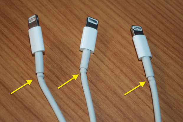
In this phenomenon, users with less technical background are more likely to believe that “pretty” designs are more intuitive than their less appealing counterparts. When those pretty websites fail them, though, the users tend to blame themselves rather than the poor UX.
Hey, maybe you really love that slide in animation! That positive emotional response makes you more tolerant of its usability faults. In this example, the slow animation is unnecessary and creates extra wait time for the user.
Conclusion
This is merely a taste of the enormous topic that is psychological UX design. As cognitive psychologists continue to study how the human brain perceives, processes, and patterns information, the landscape of UX will continue to evolve.
Form should never come before function and the only way for designers to truly understand function is to keep these principles of human psychology in mind when making design decisions. After all, strategy is at the heart of solid marketing design. The most common way of measuring the success of your website’s UX strategy is through Google Analytics’ behavior reports. Learn how to navigate your analytics and understand your audience here.


