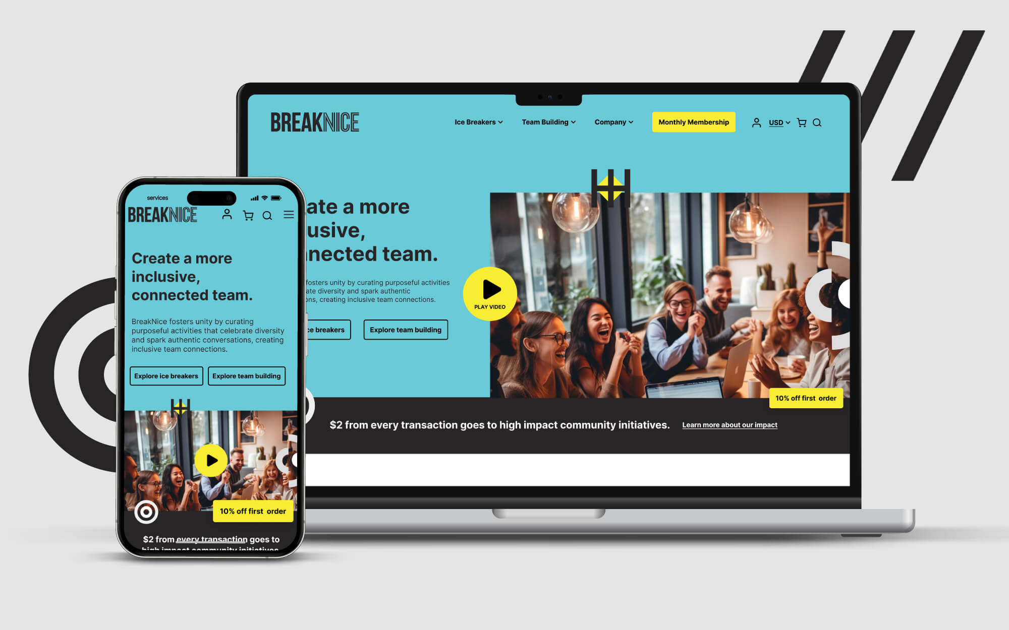
BreakNice Website Optimization
Homepage & nav menu redesign establishes 27% CTR for BreakNice
BreakNice was in need of major website optimizations, having received poor VoC responses through user testing after a recent site launch. Common sentiments ranged from not understanding what BreakNice does to difficulty conceptualizing the nature of their products to difficulty navigating through the website. The result was a low-performing website that hindered their pipeline growth.
Our brand experts identified that the underlying issues were related to brand positioning, communication of their value proposition, and user experience across the site. We set out on a journey to clearly identify what puts BreakNice at a tier above the competition, better communicate what their products do, restructure the design layout of the homepage and navigation menu, and better tie their abstract brand pieces into the overarching narrative we created. We instantly saw success post-launch as our optimizations resulted in a 27% Home to Shop page CTR for all traffic.


